Responsive Design for Mobile
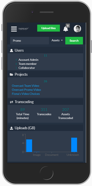
Our platform design is responsive, which means it can be used and easily navigated with mobile phones and tablets.
Our platform design is responsive, which means it can be used and easily navigated with mobile phones and tablets.
Our platform design is responsive, which means it can be used and easily navigated with mobile phones and tablets.
This website uses cookies to ensure you get the best experience on our website. To manage cookies, please refer to our Privacy Policy. Please note that you must "accept" the privacy policy to continue using this website. View the Privacy Policy
The cookie settings on this website are set to "allow cookies" to give you the best browsing experience possible. If you continue to use this website without changing your cookie settings or you click "Accept" below then you are consenting to this.